Ashby: A Display Font That Commands Attention—Thoughtfully
Two weeks ago, I was refining the hero section of a boutique online store’s new product landing page—clean layout, soft photography, intentional whitespace—and something felt off. The headline font lacked presence. Not just “nice,” but memorable. Not just legible, but distinct. That’s when I pulled up Ashby.
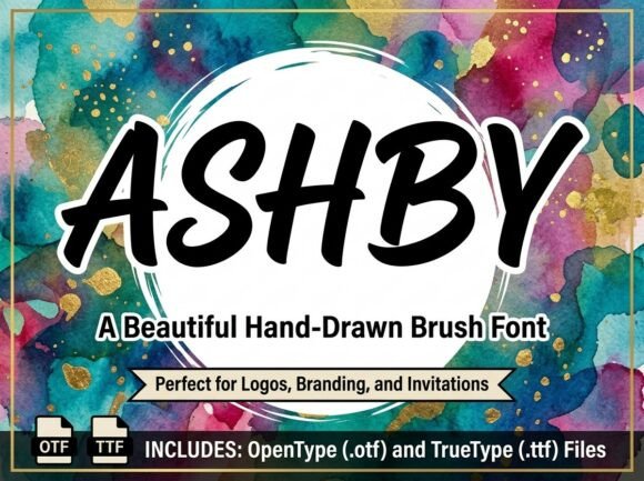
Ashby is a decorative display font with bold artistic intention. It’s not subtle—it’s expressive, with confident strokes, slight irregularities that feel hand-crafted, and an unmistakable visual personality. Think of it as the kind of typeface you’d choose for a gallery opening announcement or a limited-edition product drop: confident, curated, and quietly confident in its own voice.
In practice, Ashby works best where you want the viewer to pause—not skim. I used it for the main headline (“Handwoven Ceramics, Made Slowly”) over a muted image banner. At desktop size (48px, letter-spacing 0.5px), it anchored the entire layout without competing with the imagery. On mobile, I dropped it to 36px with tighter tracking—and it held up beautifully. No blurring, no awkward spacing collapse. It scaled cleanly because its design prioritizes clarity at larger sizes, not micro-legibility.
This is key: Ashby isn’t built for body copy, navigation labels, or dense paragraphs. It’s a display font—designed for impact, not endurance. That means its sweet spot is hero titles, section headers, CTA buttons with short action verbs (“Discover,” “Join,” “Reserve”), and branded graphic elements like newsletter banners or course module cards. I tested it on a coaching website’s “What You’ll Gain” section header—and instantly elevated the tone from generic to intentional. Same font, different context: it added warmth to a handmade pottery brand’s “About” headline, but felt too assertive for a meditation app’s tagline. Context matters.
Readability on screen? Straightforward—but with nuance. Over light backgrounds, Ashby shines. Over dark or textured overlays, I increased contrast slightly (using CSS text-shadow: 0 1px 2px rgba(0,0,0,0.2)) to ensure crisp edges. On small buttons (like a “Get Early Access” CTA at 18px), I only used it for standalone words—not full sentences—and paired it with generous padding. It breathes better that way.
Font pairing is where Ashby truly sings. I paired it with Inter (a neutral, highly readable sans serif) across three projects this month: a portfolio homepage, a digital brand kit download page, and a blog redesign. Inter handled body text, captions, and form fields effortlessly—while Ashby took the spotlight in headlines and featured quotes. The contrast created rhythm: one voice for clarity, another for character. For a more editorial feel—say, a creative writing course sales page—I swapped in a quiet serif like Cormorant Garamond for subheaders, letting Ashby remain the sole dramatic note.
Before dropping Ashby into any live project, I checked the essentials: webfont availability (WOFF2 included—great for performance), licensing (commercial use covered, no hidden restrictions), and language support (Latin-based languages fully supported; no Cyrillic or Arabic variants in this release). I also verified that the package included stylistic alternates—subtle variations for letters like “a” and “g”—which came in handy when fine-tuning logo lockups and social media graphics.
One unexpected win? Ashby’s consistency across devices. On iOS Safari, Chrome for Android, and even older Edge versions, it rendered with the same weight and proportion. No fallback surprises. That reliability made it easy to commit to—no last-minute swaps or conditional CSS gymnastics.
It’s worth noting: Ashby doesn’t try to be everything. It doesn’t have 12 weights or condensed variants. And that’s part of its strength. As a focused display font, it invites intentionality—not default usage. Every time I use it, I ask: *Is this the moment that deserves emphasis?* That question alone improved my typography decisions across layouts.
I’ve seen designers reach for flashy fonts too quickly—then backtrack when hierarchy collapses or loading feels sluggish. Ashby avoids that trap. Its file size is lean (under 40KB for the regular WOFF2), and its design avoids excessive ornamentation that can distract or slow perception. It draws attention, yes—but guides the eye, not fights it.
For creators building a cohesive digital brand—whether launching a new course, refreshing a portfolio, or designing a campaign landing page—Ashby offers something rare: expressive confidence without compromise. It supports storytelling, not overshadows it. It signals care in craft, not just aesthetics.
If you’re evaluating fonts for your next project, ask yourself: Where do you want users to stop, look, and feel something? That’s where Ashby belongs—not everywhere, but exactly where it counts.
- Best for: Hero headlines, section titles, short CTAs, logo accents, digital ads, and branded graphics
- Avoid for: Long paragraphs, navigation menus, form labels, or tiny interface elements
- Pair with: A highly legible sans serif (e.g., Inter, Manrope, or System UI) for body text—or a refined serif (e.g., Literata, Crimson Pro) for editorial contexts
- Check before use: Webfont formats (WOFF2 preferred), commercial license terms, language coverage, and available stylistic sets
- Test early: Preview on mobile, over images, with dark mode toggles, and in your actual CMS or builder—some platforms auto-convert or restrict custom font rendering